
Obviously, maps are a great way to show spatial data. But have you ever tried to show how things on the landscape change through time? Where do animals move, where are wildfires burning, where are Mountain Pine Beetles going to and coming from? Most often, this is accomplished by showing a series of maps – lifeless, static, blah. The map series can be animated by certain pieces of software (generally costing a pretty penny), but we haven’t found anything nearly as smooth as what we’ve produced using a little bit of Python programming to format GPS data, and HTML/Javascript to display the animated map using the Google Maps API (a way for the public to use the Google Maps framework). This is all free of charge, by the way.
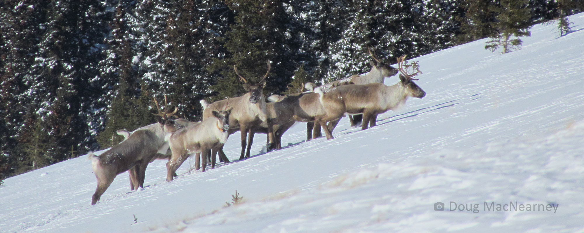
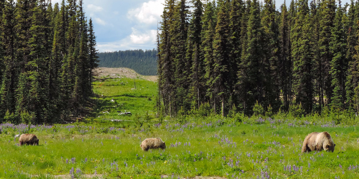
The Grizzly Bear Program at the Foothills Research Institute have fitted several bears with GPS collars. They collect an immense amount of locations and give an awful lot of presentations; showing those paths in an engaging way is important. The solution Python-whiz Julie Duval and I came up with takes GPS location files (text files), and produces an HTML file ready to display an animated map of bear movements on a Google Map.
You can look at an example here, although it only shows randomly generated paths – sorry, I can’t show you the location of local grizzly bears! The site is best viewed in Chrome or Firefox, not Internet Explorer.
If you are an FRI partner, please contact me (dwiens@foothillsri.ca) for more information on how you might better display your time-dependent data. Also, in a few days we should have a distributable copy of the ArcGIS script tool that you can use to plot your own data on a Google Map (sorry, partners only).
View the original blog post: http://darrenwiens.wordpress.com/2012/07/16/fake_bear_map/
Blog as featured on Google Maps Mania: http://googlemapsmania.blogspot.ca/2012/07/tracking-bears-with-google-maps.html